Case study · Product design
Designing a System, Not a Screen
A draft guide that has to work on day one of every new set — with almost no data — and get sharper every day after.
- Role
- Product Designer — system design
- Sector
- Gaming — Companion App / TCG Data
- Scope
- Discovery, template system, data-confidence UX
- Status
- Live · re-runs for every new set
The problem
Magic releases a new Limited set several times a year. Players need to learn how each set plays — but on release day there's barely any match data to base that on.
What I did
Designed the Set Guide as a repeatable system rather than a one-off page: one template that's useful hours after a set drops and sharpens automatically as matches accumulate.
The outcome
A guide players check before their first draft of a new set — used most heavily in exactly the window where a guide matters most.
This wasn't one product to design once. It's a system that gets re-populated from scratch every time Magic ships a set.
The challenge wasn't “build this page.” It was “build the thing that builds this page, correctly, every time.”
A new set launches with a huge appetite for guidance — players are drafting immediately — and almost no data. Winrates, archetype popularity, and card rankings are all built from real matches, and on day one those samples are tiny or don't exist. A guide that pretends otherwise misleads players at the exact moment they need it most.
draftable cards
color combinations
matches — but on release day, that data starts at zero
The real constraint wasn't visual — it was temporal. The same page has to be honest on hour one and still useful on day thirty, without becoming two products.
Early in a set's life, tiers show gaps, low-volume combinations carry visible flags, and most of the value comes from editorial framing — named archetypes, mechanic explanations. As match volume grows, the data increasingly carries the page on its own.
- Hour 1
Editorial carries it
Archetype names, mechanics, signpost cards. Tiers show gaps honestly.
- Week 1
Mixed confidence
Popular combinations rank reliably; thin ones stay flagged.
- Day 30
Data carries it
Full tiers, filterable views, card-level pick order.
The hardest decision wasn't what to show — it was what to do when there isn't enough data to show anything trustworthy yet.
| Approach | What it solves | Why it wasn't enough alone |
|---|---|---|
| Data only, wait for volume | Never misleads | Leaves the guide empty exactly when players need it most — set release |
| Curated editorial only | Useful from minute one | Doesn't scale — fresh write-ups every set, and never improves with real results |
| Editorial + data, blended with confidence flags | Useful day one, sharper over time, honest about which part is which | Requires the system to know — and show — how much to trust its own numbers |
The approach the system was built on
Curated content — archetype names, mechanic explanations, signpost cards — carries the first hours. Confidence flags like “Low Match Volume” mark where the numbers are still thin, instead of hiding thin data or presenting it with false authority.
Design a template, not a page
The real deliverable was the system: which sections exist — Set Overview, Top Colors & Commons, Archetypes & Signpost Uncommons, Combat Tricks, Set Mechanics — and how each degrades gracefully when data is thin instead of breaking or lying.
Editorial content as the day-one bridge
Named, themed archetypes — Azorius Humans, Rakdos Goblins — with short explanatory text give players a starting strategy before anything can be ranked reliably. Written once per set, designed to sit naturally beside the data once it exists.
Confidence flags instead of hiding thin data
Combinations with too few matches are marked — “Low Match Volume” — rather than suppressed or shown with the same visual weight as well-supported data. A pattern reused from elsewhere in the Untapped.gg family, applied here to the set-release maturity problem.
A template that builds the page, correctly, every time
One page structure with modular sections that show or hide themselves against volume thresholds.
- 01
Set Overview
Fast orientation to a brand-new set
- 02
Set Guide
Color tiers beside curated archetypes
- 03
Set Mechanics
Explanations written once per set
- 04
Pick Order
Card-by-card draft guidance
Avg. game turns, duration, best and worst performing colors, draftable card count — the fastest possible orientation to a brand-new set.
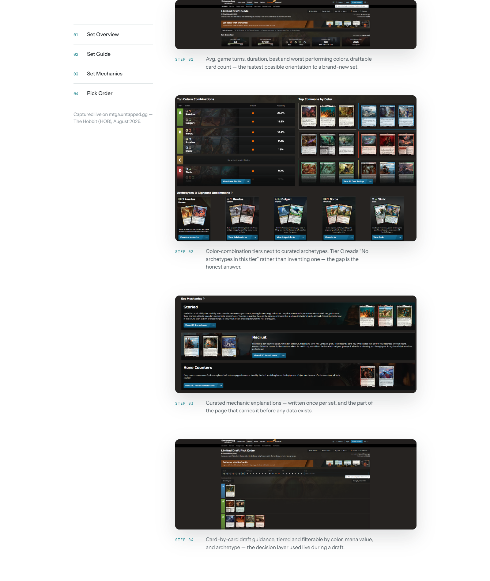
Color-combination tiers next to curated archetypes. Tier C reads “No archetypes in this tier” rather than inventing one — the gap is the honest answer.
Curated mechanic explanations — written once per set, and the part of the page that carries it before any data exists.
Card-by-card draft guidance, tiered and filterable by color, mana value, and archetype — the decision layer used live during a draft.
Captured live on mtga.untapped.gg — The Hobbit (HOB), August 2026.
The same template has to serve two very different moments — a set's first hours, and a mature set weeks later.
Rather than build two products, the trade-off was one template with modular sections that show or hide themselves against volume thresholds: more design and engineering complexity up front, in exchange for one consistent product players learn once and reuse for every set.
The confidence-flag pattern itself wasn't invented here — it's reused from other parts of the Untapped.gg product family and applied to this system's specific data-maturity problem.
Where it stands
Live and re-used for every new MTG set release, currently serving The Hobbit. Usage is heaviest in exactly the window the system was designed for: the first days after a set drops, when players most need guidance and the data is thinnest.
What I learned
Designing a system that repeats itself is a different problem than designing a single flow. The real spec isn't “what does this page show” — it's what the page does when it doesn't have enough information yet, and how it knows when to trust itself more.